
Ranking the world flags: an in-depth review of colors, symbols, and meanings
Credit: Foster Neve-Jones
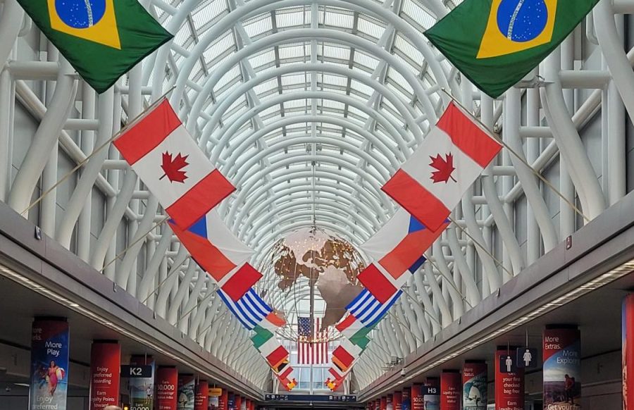
Flags like these are present in numerous public spaces like airports. Flags are often the “art” of a country, but some flags are better art than others.
May 19, 2023
You land in a new country for the first time, making your way out of the plane into the airport where the nation’s flag, the prominent symbol of that country, hangs from ceilings and flies on poles throughout the building.
Over the school year I’ve researched and ranked each world country’s flag based on the following criteria: simplicity, looks and symbolism. There are many factors that make a good flag, whether that be simplicity, overall looks or the symbolism and history behind it.
No history is worse or better than another, but some flags do a better job representing their history in a way that appeals to the eye, while others can be more complex, but still representative of their nation’s history. In this article I won’t be ranking the history or quality of one country over another, but instead the design of the flag itself and how eye-catching and simplistically representative a flag is.
The flags have been ranked from A to F, with A being the highest and F being the lowest, the same system as school grades. Instead of going through each flag individually, there are some of the standouts in each tier, explained in more depth. The final list will be linked at the end of the article.
A TIER:
Here, I’ve pulled out 3 flags to explain why I’ve ranked them as some of the best flags in the world: Barbados, Japan, and Jamaica.
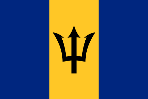 Barbados is a personal favorite of mine, not only because of its sleek design, awesome imagery and good-looking color scheme but also because of its history. Barbados is one of the few countries that got its flag through holding a national art contest to find a good design. This design was created by an art teacher named Grantley Prescod. In terms of symbolism, the blue represents the ever-present ocean as well as the sky, while the gold is symbolic of the island’s sand. The trident not only is representative of the ocean, but also represents the country’s independence from Britain, as the broken head of the trident represents the country breaking away from British rule. The flag was adopted the same night that Barbados declared independence.
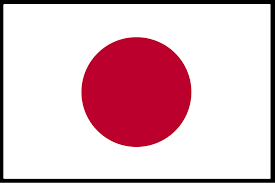
Japan is another amazing flag, with a simple design and color scheme, but gets its place at the top largely because of its symbolism. In Japanese history, the Emperor is said to be a descendant from a sun goddess, and the red circle is meant to represent that sun. The Japanese flag is one of the most recognizable symbols and flags anywhere in the world due to its importance in history and its simplicity.
 The Jamaican flag is another one of my favorite flags, partly due to its unique color scheme. The green and gold pair with each other wonderfully and the black adds a level of contrast. The symbolism is important too, with the gold representing the sun and the green representing the land, while the black represents the strength of the people and how they overcame hardships. It’s also the only country flag in the world without red, white or blue, so it has a certain uniqueness.
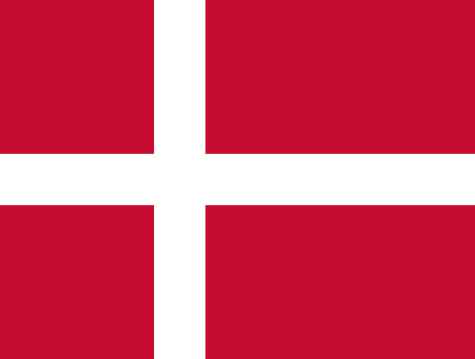
Honorable mention to Denmark for having the oldest continuously used flag in the world!
B TIER:
Many of the flags in this tier have an interesting history, a unique look or an interesting color scheme. Two flags that are definitely good looking, but are either a little too complicated or a little too simplistic to rank higher are Vanuatu and Somalia.
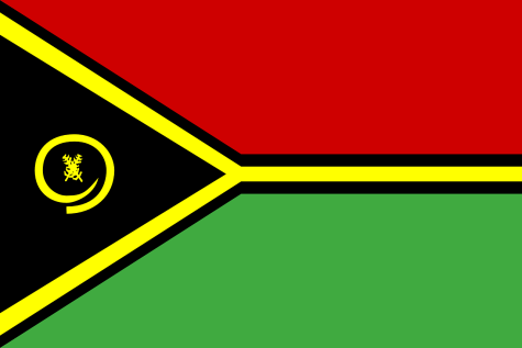 The Vanuatu flag is very interesting: it has a great color scheme following the Pan-African colors representing the unity of African nations, but there’s a few complicated parts. The gold sideways Y shape and the organization of the colors is strange but also a great combination of colors. While the symbolism behind the boar’s tusk and the leaves of the local namele trees that are present in the flags design are definitely super-interesting. The design is a little difficult, which moves it down into the B tier.
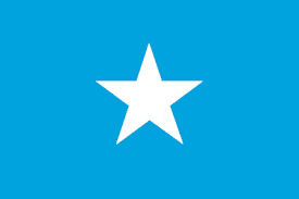 The flag of Somalia is a very different flag from Vanuatu. This flag is symbolic, straight forward and pretty, but overly simplistic.. A simple star represents Somalia’s 5 districts on a cyan field taken from the background color of the United Nations flag.The lack of great individual symbolism gives it its place here in the B tier.
C TIER:
In the C tier we get to a place where there’s typically some interesting trivia, but either the flags weren’t appealing enough or they were strangely configured. Many of the flags in this tier are very similar, lots of either red-white-blue or the traditional Pan-African colors, without as much interesting history to warrant them being ranked higher.
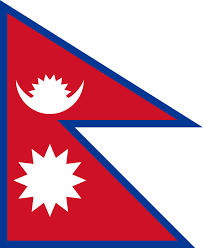 Nepal’s flag is something else entirely. The shape is incredibly unique, taking from South Asia’s history of triangular flags. However, the flag style isn’t very cohesive. The symbolism is interesting, with the triangles representing the Himalayas, while the symbols of the flag are celestial bodies. The contrasting symbolism adds a little confusion, which places it in the C tier.
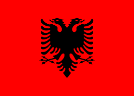
The Albanian flag is definitely cool looking, with the red and black giving a very cool contrast, but the eagle is a little too complicated of a symbol to have on a flag. The flag also has a violent history, as it was used by Albanian nationalists and by rebels before that. The red of the background represents a blood-soaked field, which is a little too combative for my tastes.
Mauritania’s flag, while not being very simplistic, has a great color scheme with the Pan-African colors and interesting symbolism. Recent changes came in 2017, with the two red stripes being added that represent “the efforts and sacrifices that the people of Mauritania will keep consenting, to the price of their blood, to defend their territory,” according to News24. This is cool, but once again, the history is too bloody for me to rank their flag higher.
D TIER:
Here’s where we start to get to some of the weirdly designed flags, ones with incredibly complicated symbols or insignias that clutter what should be a simple flag. These are also flags that have the issue that the designs are so complicated that their histories doesn’t redeem them., so I’ve placed them lower down in the list.
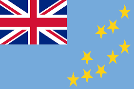 The flag of Tuvalu isn’t the best made flag, it takes the British flag and places it randomly in the corner, which has a weird effect on the entire flag. Tuvalu was under British rule, but many countries changed their flag after gaining their independence. However, Tuvalu kept with the same flag, and it looks like it was thrown together with a weird color scheme and confusing design. It also lacks the uniqueness of many of the flags above it.
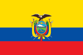
The Ecuadorian flag is also overcomplicated, with the flag including their coat of arms. I tend to have an issue with a flag including their country’s coat of arms, as it clutters the space and they tend to be super complicated. The meaning behind the color choices is interesting, supposedly coming from a late night conversation between a Venezuelan general and a German poet about color theory, which seems more like a personal joke for a national flag than anything else, the colors are just too contrasting and don’t pair well together. Also the stripes are unequal.
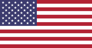 It’s definitely hard to say, but the United States flag really isn’t great. The history is interesting having gone through multiple variations as new states and new stars have been added, but it’s a little boring compared to other flags. The symbolism is fine, but adding in 50 stars to a rectangle is really just a lot. I remember trying to draw this as a kid and fitting about 20 stars into a square before I gave up.
F TIER:
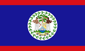 Starting off the F tier we have the flag of Belize, which just has a good bit of trivia in that it’s the only flag in the world that predominantly displays humans in the flag, the figures representing the diverse people in the country. However, the flag is a mix of being incredibly complicated and also boring. The coat of arms is way too complicated to put on a national flag. I figure when you need a full essay to describe the design of your flag, when most people will only glance at it in an airport for a second, there’s a disconnect between the meaning and purpose of the flag.
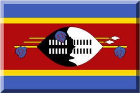 The flag of Eswatini is definitely interesting. It has some very specific history but is one of the least simple flags in the world in my opinion. The black and white shape in the middle is a traditional ox-hide combat shield along with two spears and a traditional Swazi fighting stick, which has a long history in the country as a fighting implement. This flag is incredibly complicated, and the color scheme along with the stripes aren’t very complementary. The mix of complications and strange color scheme means that the flag of Eswatini gets its spot here in the F tier.
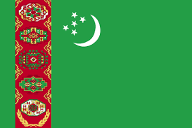 The Turkmenistan flag is the one I referenced at the beginning of the article for its crazy complicated design, using traditional carpet guls, which are customary carpet designs for production in Turkmenistan. The stars and moon are typical of Islamic designs, but I feel the design is too complicated to be anywhere but this lowest tier. When you look up, “what’s the most complicated flag,” the Turkmenistan flag appears.
Flags are complicated – they can represent so much and are often ignored – just a symbol in the background. Flags are essential because they give a country flavor and highlight the most important parts of a nation’s history. They are, therefore, deserving of praise and should be shown off as the pinnacle of a nation’s history.


randall • Apr 6, 2025 at 12:56 am
Whoever wrote this drivel is an idiot, I imagine the concept of research was of less interest than nail ideas or scrotal warts.